For several years now, i have thrown around the idea of opening a brick and mortar gallery. Location, monetary considerations, staffing, etc. were obviously a concern. Today, as i write this, my thoughts and focus have changed completely. Why would you want to come to my gallery, during my hours of operation, to see what my photos look like in a setting that has been completely staged to make them look amazing? Similar to the strawberries that look a brilliant deep red in the grocery store or the shirt that looked amazing in the dressing room, only to get them home under normal conditions and wonder did i buy this? Wouldn’t you rather see what the art looks like in a home or office…..under “normal” lighting conditions? In the end, isn’t it more important how it looks in the very specific lighting conditions of YOUR location. This is were the flexibility, transparency, and personal touch of the mobile gallery concept comes into play.
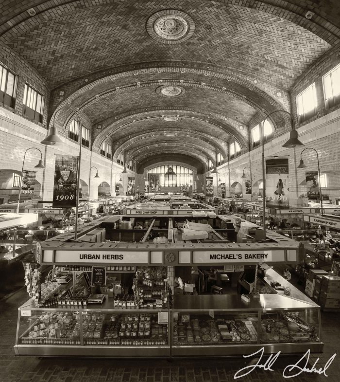
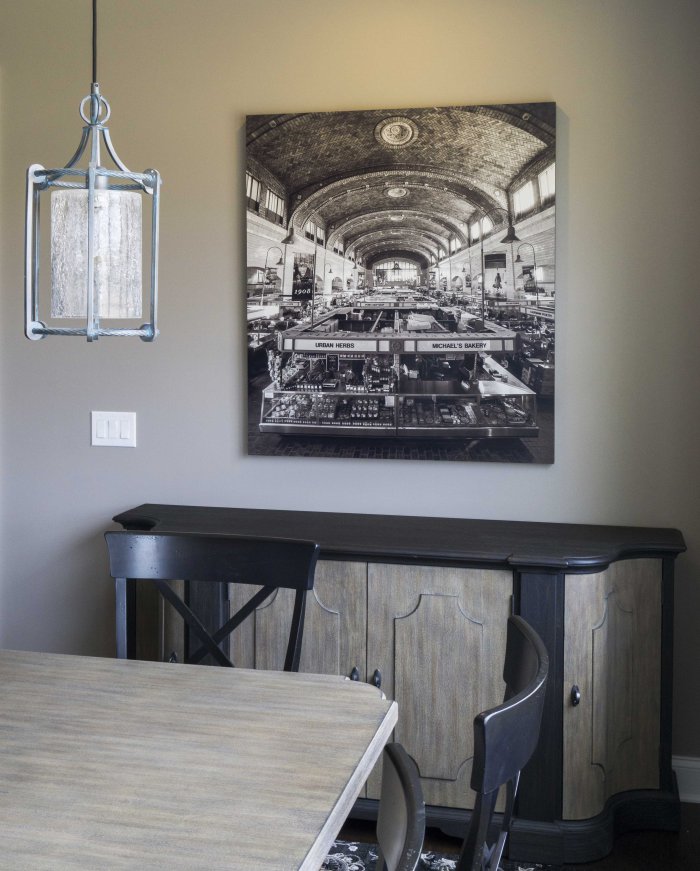
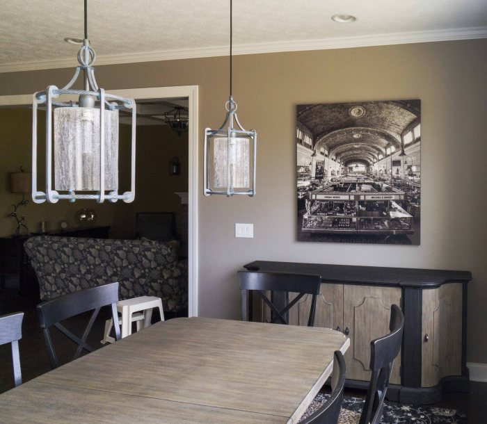
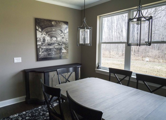
To illustrate this point, i am going to use a specific example involving a large custom metal print that i recently did for very dear friends of mine. They had just built a gorgeous custom home and were looking for a focal point in the heart of their home, the kitchen and dining area. This essentially is the only wall space for art in the entire area and they had very specific ideas of what they wanted. So instead of coming to my space, i went to visit theirs. This allowed me to see the space and accurately evaluate all of the factors that go into integrating the art into their home: size, light, location, etc. They had previously expressed interest in an image i had taken of the Westside Market in Cleveland, which was actually a vertorama, a series of 3 overlapping horizontal images merged together in post production. (shown above) So we set up an appointment to meet in their home. The original image was in color, but they were thinking that black and white or sepia tone might suite the space better. By personally visiting the home, i was able to see the space and we collectively determined that B&W was going to be too cold and sepia was going to be too brown for the space. So i decided to create a custom tone to better suit their home and i printed some sample images on photo paper and set up a follow up visit. The custom tone turned out to work perfectly with the surroundings. One other consideration that came up during the visit was the amount of light the area receives. The wall space is flanked by a wall of windows, great for allowing an abundance of natural light for the piece, but too much for my standard high gloss metal print finish. So we opted to move forward with the mid-gloss finish. The space was measured and an optimal size was determined. The result of all of this was a custom toned, custom sized, framed, 41” x 46” one of a kind framed metal print, perfectly suited for their home……try finding that in a gallery!!


This exemplifies the beauty and versatility of the mobile gallery. I am sure there will be detractors that will say that this isn’t art, etc. and i am fine with that. This is how i roll……what you see is what you get. This transparency, person ability, and approachability is what i think sets me and my work apart. It’s not just a piece of art hanging in a gallery, that you are too nervous to even ask how much it is, etc. Sure Art.com has art at very affordable prices. But when someone asks about a piece of art in your home, wouldn’t it be more interesting to tell them a story similar to this, as opposed to “Oh, I’m not sure where that picture was taken or by whom…..i got it cheap on line.” My work becomes a fully integrated focal point of your home or office, and it has a great story behind it!!
To contact me or see more of my images, head over to my website: http://www.toddsechelstudio.com
